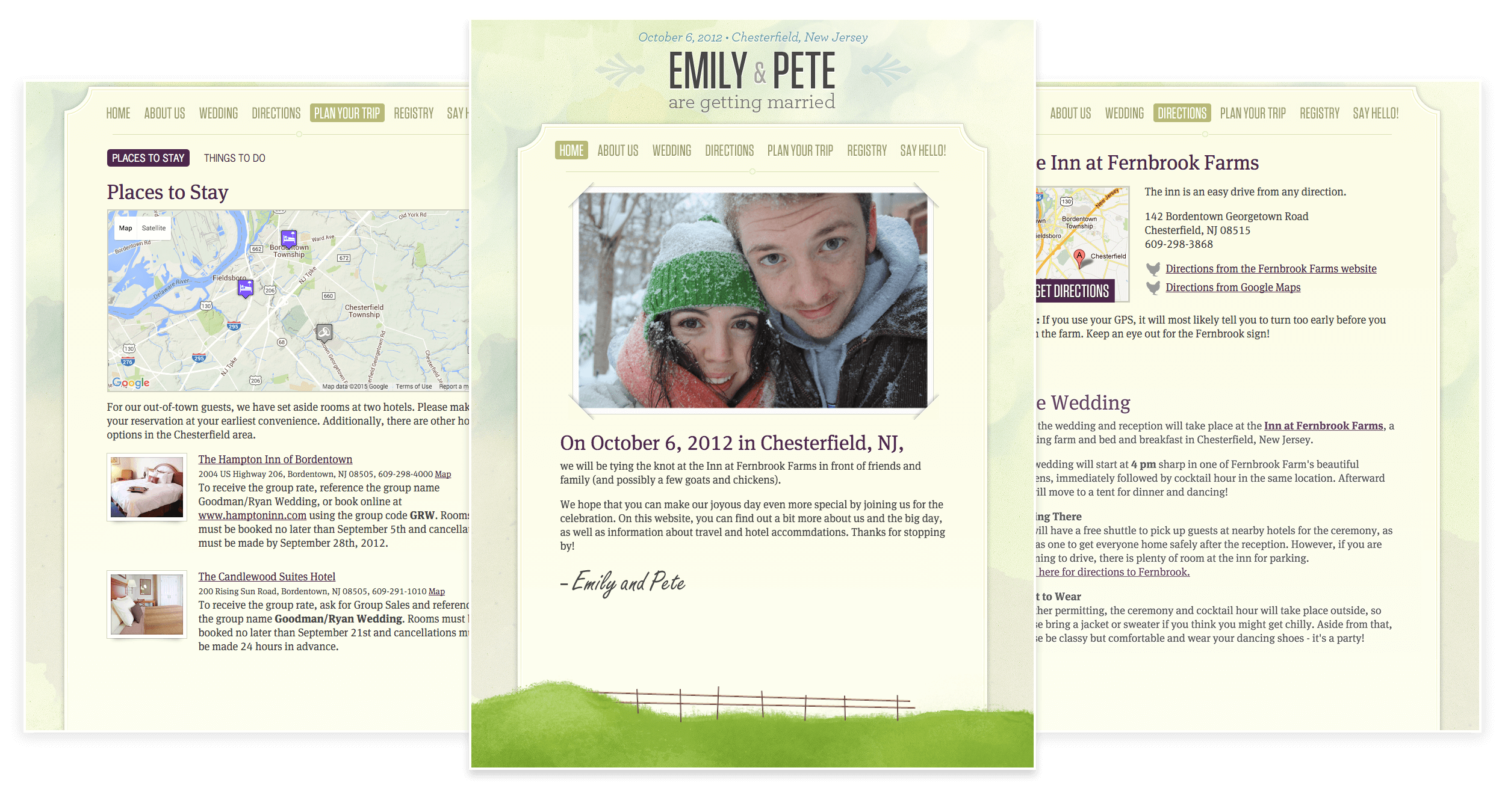
2012 Pete and Emily Get Married Print Design, Website Design & Development
When my wife and I got engaged and started planning our wedding, I had a few ideas about what aspects of the big day I wanted us to take total ownership over. My first big (foolish?) idea was to make the wedding cake myself, which was shot down immediately by multiple family members - and while I do love baking, they were totally right on that one. Plus, we ended up fulfilling my compulsion there by making individual jars of homemade apple butter for each guest as a parting gift (glad we did it, would maybe not do it again).
One area I was pretty confident about us taking on was the printed material. Little did I know at the time how much would be involved in not only creating the designs, but also sourcing the materials and making sure everything was printed correctly. I also didn't realize the breadth of actual projects we'd be tacking in order to keep things consistent. All in all we created save the dates, invitations, menus, ceremony programs, and thank you cards. It was a real learning experience in creating a design system, working within a budget, and dealing with unexpected surprises - like when the paper store discontinues the material you're using halfway through your process.

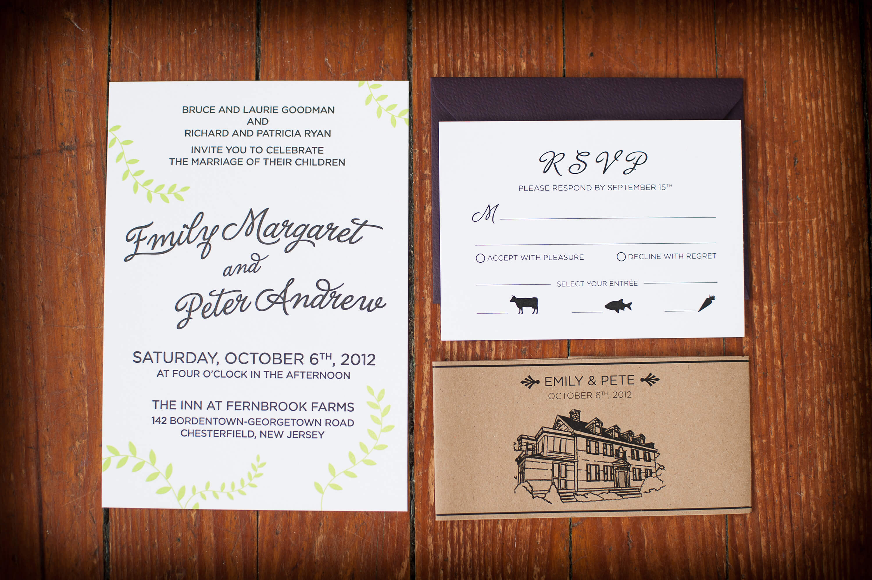
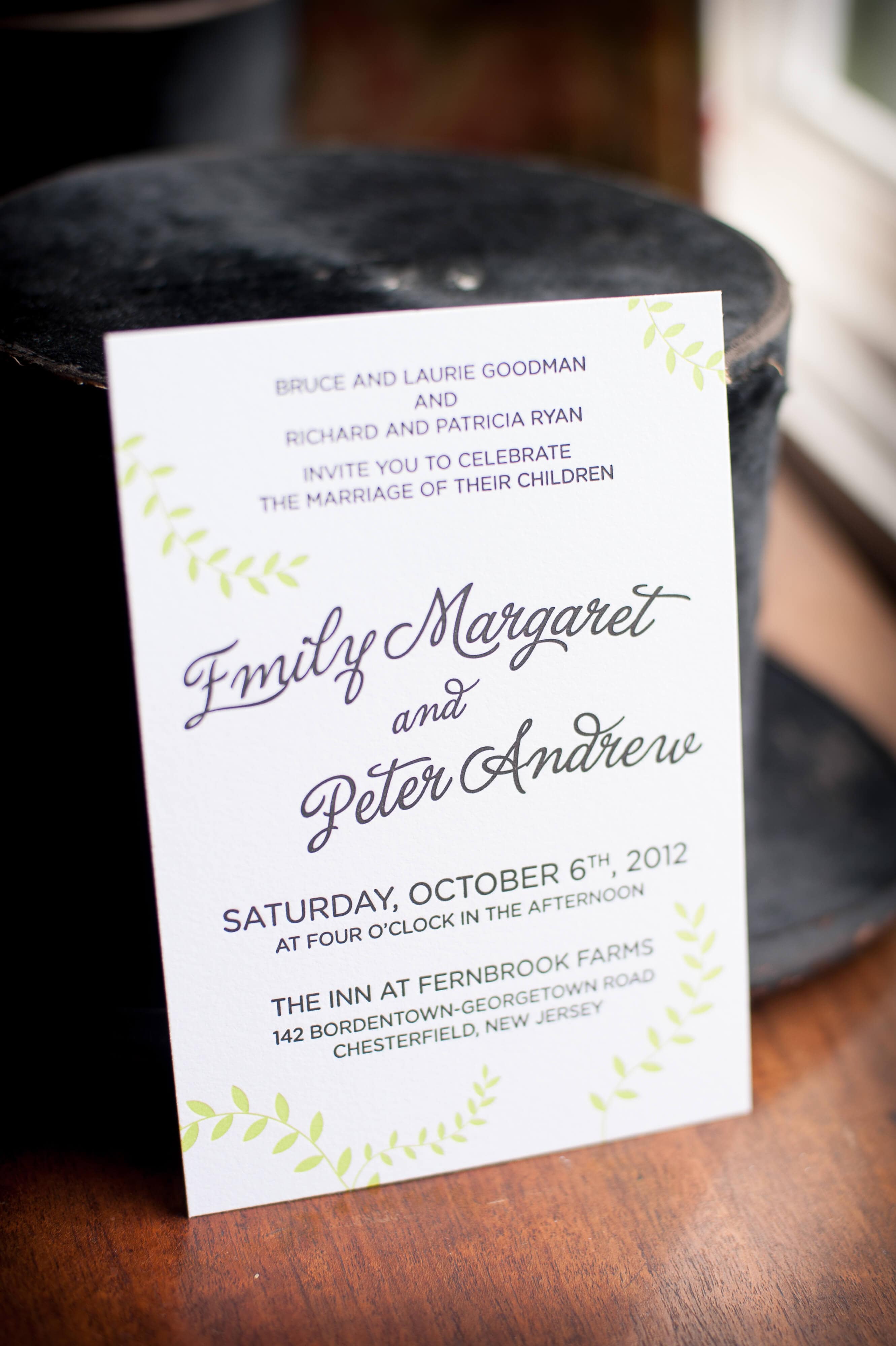
Our venue was a historic mansion at a small working farm, so we wanted the feel to be classy but not stuffy, and just a little bit country. We also decided, after assembling all of the information that needed to be included on the invitation (it's always more than you think!), that the design would be largely typographically driven. The wording was reworked many times to keep the design balanced while still communicating everything we needed.
The invitation, RSVP card, and directions card (not shown) were wrapped in a band, made of a paper bag material, featuring a rendering of the mansion, drawn and inked by me from a photograph we took on our first visit to the venue. The main font used throughout is Gotham Rounded from Hoefler & Co. with splashes of La Portenia from Sudtipos for script type. Almost all of the pieces were laser printed at a local printer. While my wife and I drooled over wedding blog posts of letterpressed everything, we found that it just wasn't realistic for our budget. We couldn't pull ourselves completely away from the idea though, so we decided to splurge on the main invitation card, which was letterpressed by a friend and artist. She did a fantastic job not only on the printing, but also walking us through the process - we even got to watch her work at a local studio.

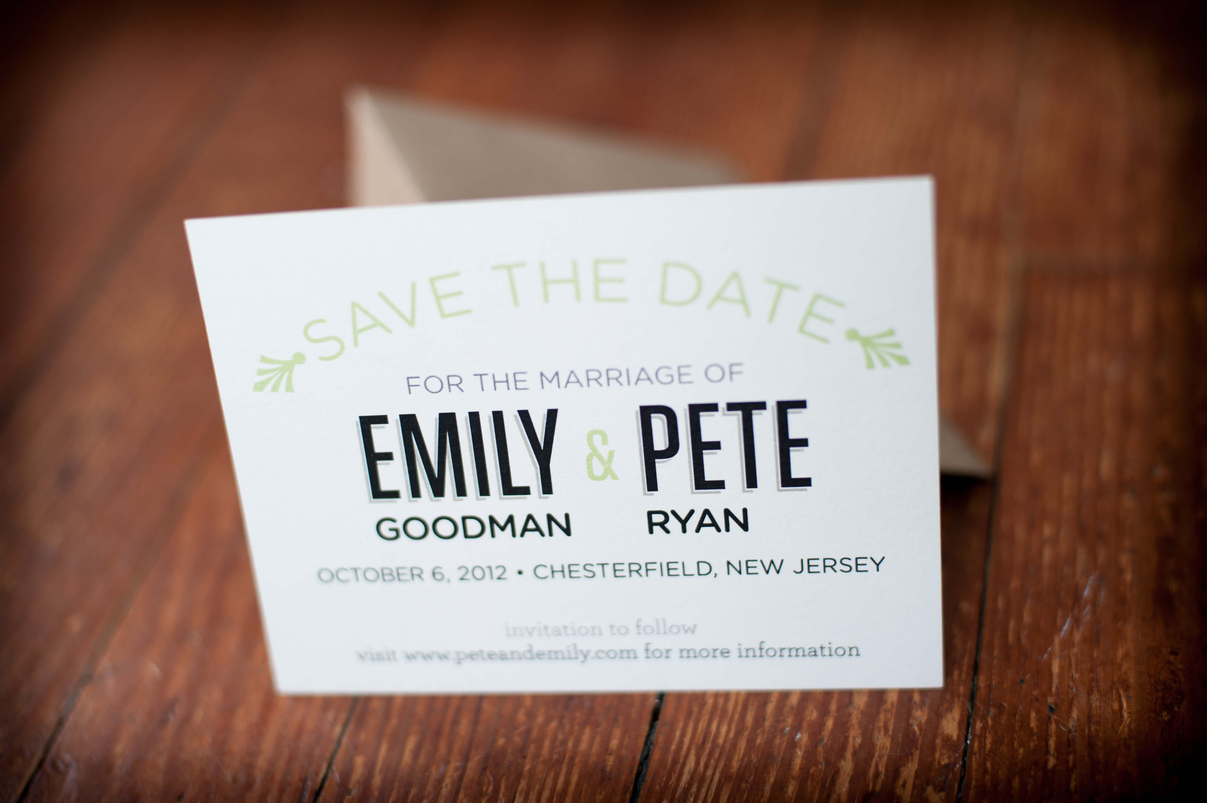
The save the date card featured Tungsten and Archer from Hoefler & Co. The green was matched to the invitation, and they were sent in envelopes made of a paper bag material.


Designing for yourself is never easy, and the significance of the big day didn't help to alleviate any pressure. It was a big challenge, but I'm so happy that we made it our own.
All photos shot by Susie Sefcik.